
A beautiful drawing can lose its force the moment the color starts to crawl, flicker, or spill past the clean-up. Learning how to color animated scenes means building a repeatable production method, not treating every drawing like a separate illustration. Your job is to preserve the performance in the linework while making hundreds of frames read as one moving shot.
The best coloring workflow starts before the paint bucket touches a frame. Clear linework, a sensible palette, and a shot-by-shot plan will save far more time than trying to repair inconsistent color after animation is already in motion.
Start with a color plan for the shot
Color belongs to the scene, not just the character. Before painting, decide what the audience should notice first. A character in a dark hallway may need a lighter local color or a controlled rim light to separate from the background. A sunny exterior may call for flatter, brighter colors so the action reads immediately.
Create a small palette for each sequence: local colors for characters and props, shadow colors, highlight colors, and any special-effect colors. Keep those choices limited. Too many near-identical colors make continuity harder and slow down every correction. Traditional animation is built on clarity, and color should support that clarity.
This is also the time to establish color keys. A color key is a reference image showing the intended mood for a location or lighting condition. If a scene moves from afternoon into sunset, the palette should change for a reason. Without a key, one artist may paint warm shadows while another uses neutral gray, leaving the sequence with a patchwork look.
Prepare clean line art before you paint
Fast painting depends on dependable boundaries. Gaps in the linework, stray marks, and lines that do not fully close will turn a simple fill into a cleanup problem. Check the scene at playback speed as well as frame by frame. A line that looks harmless on one drawing can pop or chatter when it moves.
Keep color on layers beneath the clean-up whenever possible. That protects the line art and lets you correct a fill without redrawing the contour. It also gives you room to test shadow and highlight treatments without damaging the approved drawing.
If your scene uses variable line color, establish the rule before production begins. Dark brown lines may work better than black in a warm scene, while blue-gray lines can sit more naturally in moonlight. The trade-off is added complexity. For a short student film or a small crew, consistent dark linework is often the faster and safer choice.
Check the drawing order
Before filling, confirm which elements sit in front of others. Hair in front of a face, a hand crossing a torso, or a prop passing behind a character all need a clear stacking order. Painting first and sorting layers later invites edge errors and accidental holes.
Treat every scene as a stack of cels: background, distant effects, body, clothing, foreground hand, prop, and any overlay effects. The exact order depends on the shot, but deciding it early keeps the work predictable.
How to color animated scenes frame by frame
Begin with flat colors. A flat is the base color inside each closed area, with no lighting information yet. Flats should be clean, stable, and easy to inspect in motion. Do not start with elaborate rendering. If the base colors are inconsistent, more shading will only make the inconsistency more visible.
Paint a short section first, then play it back. A useful test is eight to sixteen frames of the most difficult action in the shot. Look for small unpainted gaps, color popping at the edges, or areas where a fill changes shape too abruptly. Fix the method before you paint the entire scene.
When the drawing changes only slightly from one frame to the next, use your previous frame as a visual guide. But do not blindly copy it. Animated forms compress, stretch, overlap, and rotate. A color boundary must follow the volume of the form, not merely trace the last drawing’s shape.
For example, a sleeve may have a blue flat and a darker blue shadow. As the arm swings toward camera, the shadow shape can widen because the cylinder of the arm is turning. If you keep the exact same shadow contour on every drawing, the color will appear to slide across the sleeve instead of turning with it.
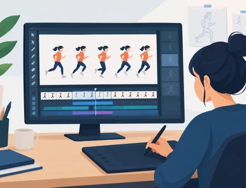
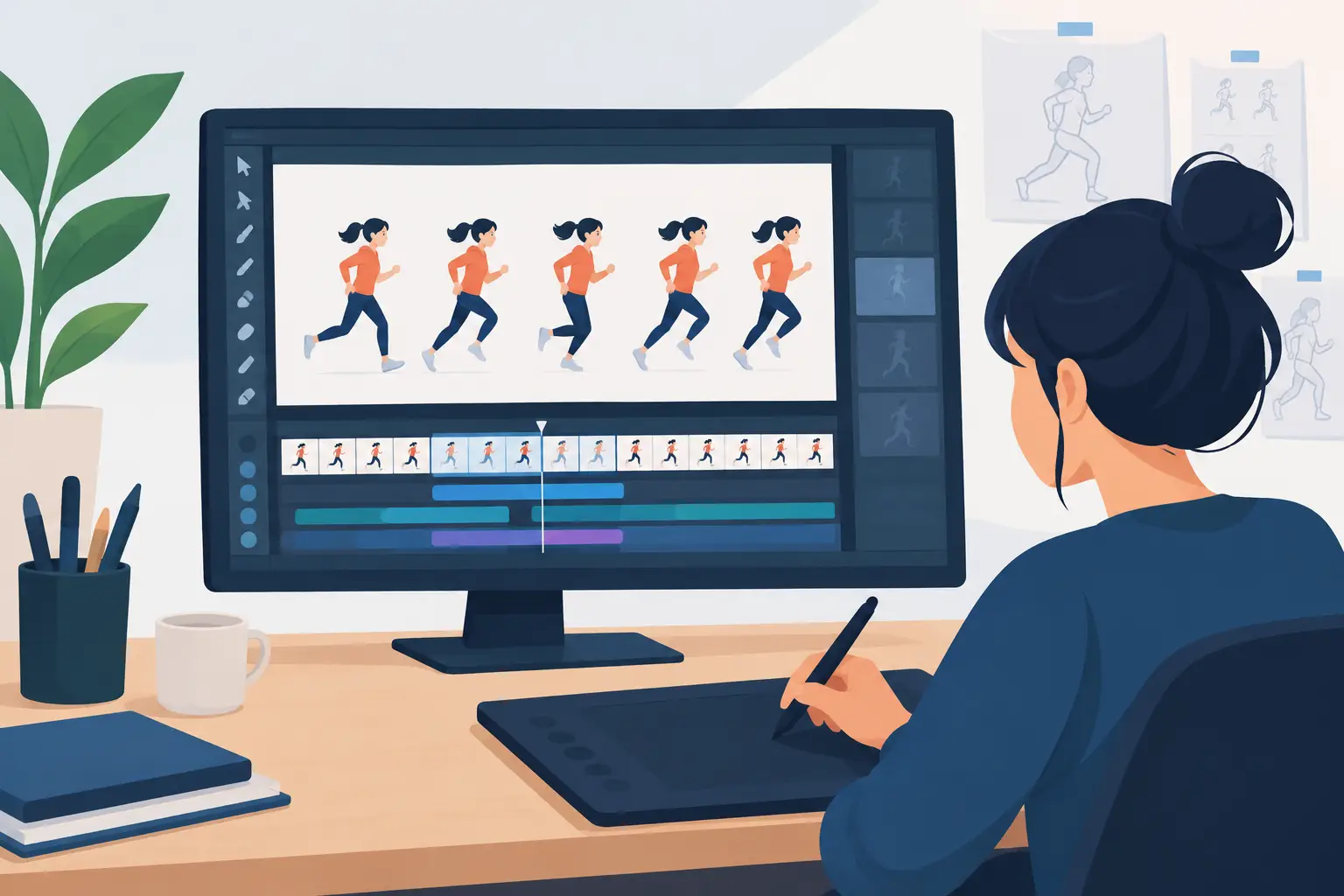
In FlipBook, efficient painting tools let you fill and check drawings quickly while staying close to the frame-by-frame workflow traditional animators expect. Use that speed to review the scene often, not to rush past the review stage. Playback is where color errors become obvious.
Add shadows that follow the action
Once the flats hold together, add shadows with restraint. Most television and independent 2D animation uses one clear shadow tone, sometimes with a second darker accent for special moments. This keeps the image readable and keeps the painting load realistic.
Define the light direction for the shot. If the key light comes from upper left, shadows should generally fall down and right across every character and prop. There are exceptions: reflected light, self-shadow, and moving light sources can alter the pattern. But exceptions need a visual reason. Random shadow placement makes a scene feel assembled instead of animated.
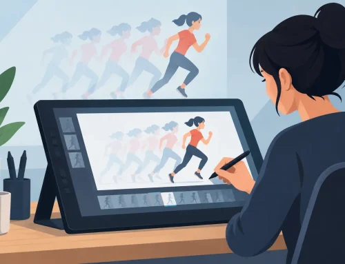
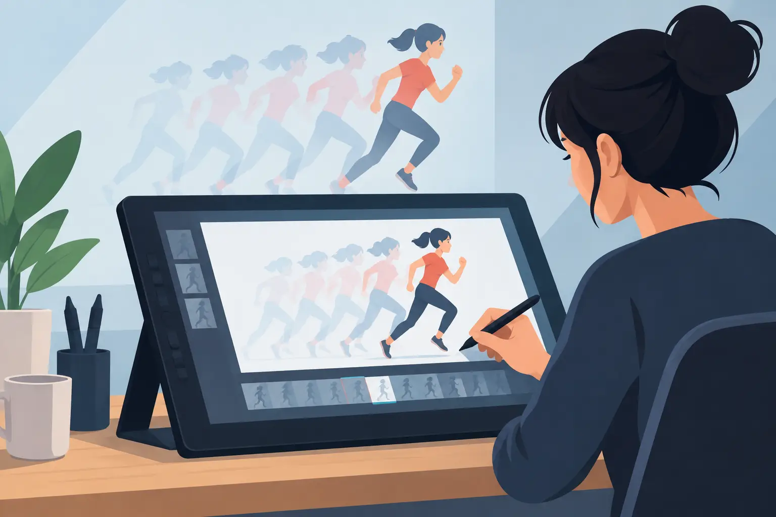
Watch the shadow shapes during fast actions. A shadow can change from frame to frame, but it should change because the form moves or the light changes. If it jitters along a cheek, collar, or shoe, simplify the shape. A clean, slightly broader shadow usually looks better in motion than a highly detailed one that flickers.
Use highlights only where they earn their place
Highlights can direct attention to an eye, a metal object, wet pavement, or a strong turning form. They can also create unnecessary painting work. Add them when they clarify material, lighting, or focus. Skip them when they merely decorate a frame.
The same principle applies to gradients, texture, and soft airbrush effects. They can be effective in a special shot, but they are harder to maintain across many drawings. Flat color with deliberate shadow shapes remains one of the strongest looks in hand-drawn animation because it reads cleanly at speed.
Protect color continuity across the sequence
A scene may be painted by one person, several artists, or you over several late nights. Continuity needs a system either way. Keep approved palette swatches available for the entire sequence. Name colors clearly by purpose, such as Character Skin Base, Jacket Shadow, or Evening Window Glow, rather than relying on visually similar unlabeled samples.
Review neighboring shots, not just the shot in front of you. A character’s red shirt may look correct against one background but become too dull or too bright after a cut. Color continuity is partly technical and partly editorial. The audience experiences the sequence as a chain of shots, so inspect it as a chain.
Pay special attention to reused cycles. A walk cycle, blink cycle, or repeating hold should return to the same colors and shadow logic every time it loops. One altered fill in a cycle can become more noticeable than a larger mistake in a one-time action because the audience sees it repeatedly.
Inspect at production speed
Zoomed-in painting is necessary, but it can fool you. At 400 percent, you may spend time repairing details no viewer will ever see. At normal playback, a tiny edge gap can flash like a warning light. Move between close inspection and real-time playback throughout the job.
Check the scene against its actual background and camera move. A pan, zoom, rotate, blur, or dissolve can change how colors read. A light character may disappear against a bright background during a camera move, while a subtle shadow may become too heavy once the scene dissolves into a darker shot.
Use a final pass to inspect for four common problems: missed fills, colors outside the line, changing palette values, and shadows that do not track the form. These are production corrections, not cosmetic fussing. They are what make the scene feel finished.
Color is part of the animation performance. When your flats are stable, your shadows follow the forms, and your palette serves the shot, the audience stops seeing the paint work and starts believing the drawing is alive.