A painted cel can make a well-animated drawing feel finished, or expose every small weakness in the scene. A color spill at the eyelid, a gap along a moving hand, or a shadow that jumps from frame to frame will pull attention away from the performance. Learning how to paint animation cels is not simply about filling enclosed shapes. It is about preserving the clean-up, supporting the action, and making color work at production speed.
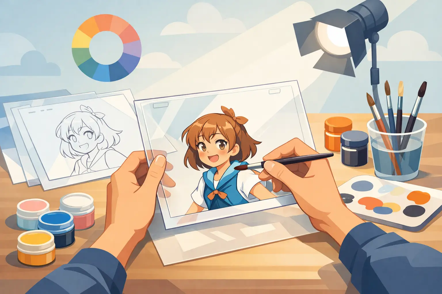
Traditional cel painting had a physical order: the ink line was on one side of the acetate, while paint went on the reverse. In digital 2D animation, you can work with more flexibility, but the production discipline still matters. Your paint needs to stay organized, consistent, and easy to revise when a director, client, or your own better judgment calls for a change.
Start With Clean, Closed Line Art
Painting begins before you select a color. A fill tool can only work as cleanly as the line art allows. Inspect each drawing at the same zoom level you will use for most of the scene. Look for open contours around fingers, hair strands, cuffs, and overlaps. Tiny breaks can send a fill across half the frame, while doubled lines can create awkward slivers of color.
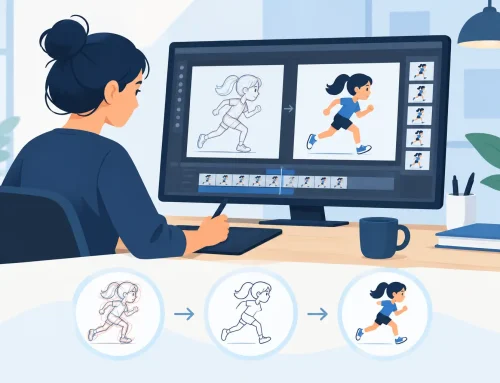
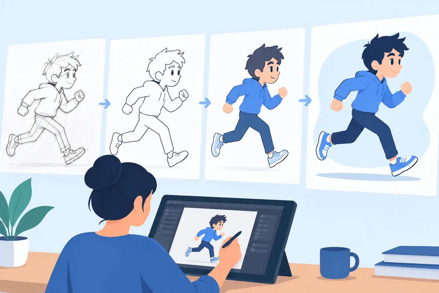
For production work, separate your rough animation, clean-up, and paint whenever possible. Roughs are for motion decisions. Clean-up establishes the final shape and line weight. Paint should follow the approved clean-up, not compete with it. If you are still redrawing contours while trying to color, the scene is not ready for paint.
This does not mean every shape must be completely sealed. An intentionally open line can be part of the design. The point is to know where your boundaries are and use a painting method that will not leak through them. When an area is difficult to close without harming the drawing, paint it manually or use a carefully prepared fill region instead of forcing a global fill.
Keep Lines Above Your Color
The most dependable setup places the line art on a layer above the color. It keeps the drawing crisp and lets you correct paint edges without damaging the line. It also gives you room to make small paint overlaps beneath the line, which prevents thin unpainted halos from appearing during playback.
That overlap matters. A perfectly edge-to-edge fill may look fine in a still frame, then flicker when the drawing shifts slightly on the next exposure. Let the color extend just under the line where needed. The viewer reads the line as the edge, not the microscopic boundary of the paint.
Build a Palette Before You Paint Frames
Do not pick colors by eye on every drawing. Create a scene palette first: character base colors, clothing colors, props, background colors, shadow colors, highlights, and effects colors. Give each color a clear purpose. A named palette prevents the common problem of having six nearly identical skin tones scattered across a shot.
For a character scene, a practical palette often includes a local color, one shadow color, and one highlight color for each material that needs modeling. But that is not a rule. A flat, graphic film may use only local colors. A more dimensional short may need several values. The right choice depends on the style, the schedule, and how much movement the shot contains.
Test the palette against the actual background before painting the whole scene. A color that reads beautifully on white can disappear against a warm interior or vibrate against a saturated sky. Check the scene at playback size, not only at a large working zoom.
Paint Flats First, One Logical Area at a Time
Flat colors are the foundation of the shot. Start with the largest, simplest areas, then work toward smaller details: body, costume, hair, facial features, accessories, and effects. This order makes errors easier to spot. It also reduces the chance that a later fill will cover a detail you already finished.
For enclosed areas, use a fill tool with a tolerance that matches the softness or texture of your line. A low tolerance may leave tiny gaps along anti-aliased edges. A high tolerance may eat into the line or cross a narrow opening. Test it on a difficult area first, then keep the setting consistent across the scene.
For irregular shapes, fast-moving drawings, or lines with deliberate openings, use a brush or paint stroke rather than fighting the fill tool. The fastest method is the one that gives you a clean result without repeated correction. Automation helps, but it should not dictate the look of the drawing.
In FlipBook, the paint workflow is designed for this kind of frame-by-frame work: paint quickly, scrub the scene immediately, and correct problems while the action is still in front of you. That is more useful than treating each frame as an isolated illustration.
Work in Passes, Not Finished Frames
A common beginner mistake is completing every color, shadow, and highlight on frame one before moving to frame two. It feels orderly, but it makes consistency harder to judge. Instead, paint the local color across the full shot first. Then add the next color pass. Then handle shadows, highlights, and effects.
Working in passes lets you see whether a color shape holds together through the action. If the character’s sleeve changes shape quickly, you can focus on keeping that one color region stable from drawing to drawing. You are comparing like with like, which is exactly what the shot needs.
Check Your Paint in Motion Constantly
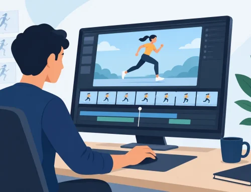
A single painted drawing can be beautiful and still fail in the scene. Playback reveals problems that still images hide: color chatter along contours, a shadow that changes size without reason, a missing fill on one exposure, or an accidental color swap between adjacent frames.
Scrub back and forth over a short section, then play it at speed. Watch the silhouette first. If a large color area is jumping, fix that before worrying about small details. Next, watch the face, hands, and any part of the body carrying the acting. Finally, inspect secondary details such as buttons, hair highlights, or trim.
Timing changes can affect painting decisions too. If you alter an exposure, add an in-between, or hold a drawing longer, review the paint immediately. A hold may make a subtle paint mistake more visible. A new in-between may need a color shape that transitions more gradually between the surrounding drawings.
Add Shadows That Follow the Form and the Action
Shadows are not decoration. They clarify planes, separate overlapping forms, and support the lighting of the scene. Before painting them, decide where the light is coming from and what should stay consistent throughout the shot. If the light is from upper left, do not casually reverse it because one individual frame looks more attractive.
Keep shadow shapes simple enough to animate. A complicated patch of shading can look impressive on one drawing but will drift, boil, or consume too much time across twenty-four frames. Shape the shadow around the major turn of the form: under the chin, inside the far arm, below an overhanging brim, or on the underside of a moving object.
The trade-off is clear. More rendering can add richness, but it can also slow production and distract from the movement. For most hand-drawn scenes, a few deliberate shadow shapes look stronger than a crowded collection of tiny ones.
Prevent Common Cel Painting Errors
The cleanest paint jobs come from catching predictable errors early. Before calling a shot done, check for these four problems:
- Unpainted pinholes and thin white seams, especially around tight line intersections.
- Colors that bleed through gaps in the line art or cover details on a lower layer.
- Inconsistent palette choices between drawings, including slightly different values for the same local color.
- Shadow and highlight shapes that pop, slide, or change volume without a reason in the animation.
Do this review in motion, then zoom in only where playback tells you there is a problem. Staring at every pixel is slow and rarely improves the shot. The audience sees the scene moving at its intended size.
Make Revisions Without Breaking the Scene
Painting revisions are normal. A client may request a costume color change. A background may be redesigned after the character is already painted. A director may want a stronger focal point in a close-up. A well-organized palette and separate paint layers make these changes manageable.
Keep your color areas editable until the shot is approved. Avoid flattening everything too early, and save versions before major changes. If a revision affects multiple frames, make the change as a controlled pass across the shot, then play it back. The goal is not just to update the color. The goal is to preserve continuity.
A good paint pass respects the same principles as good animation: clear choices, consistent construction, and constant attention to what happens between drawings. Start with clean lines, use a controlled palette, and judge every decision in motion. When your colors support the performance instead of calling attention to themselves, the animation starts to feel alive.